
Distribution of results per hour/half-hour/per month, ...
should be improved to to show extremes during that period.
For example, current chart of monthly results looks like this:
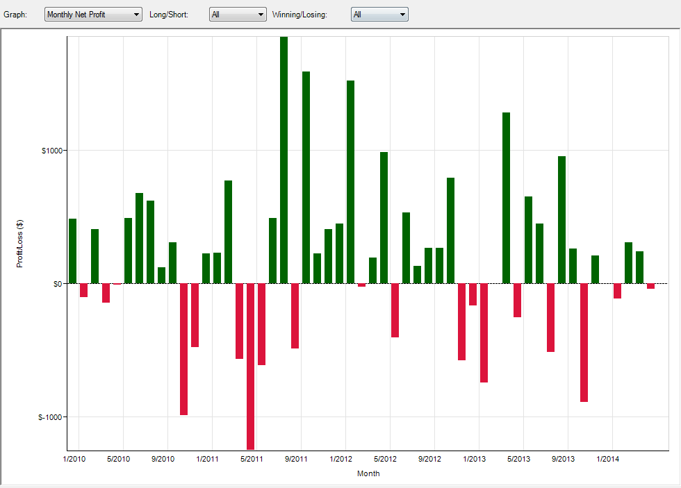
Problem:
It is good, how each month finished - we see the final value at the end of the month
But we are not able to evaluate, what was the lowest value during that month = biggest drawdown in that month. So we are not able to evaluate the real operational drawdown.
This would require to add a MIN/MAX value to the bar, because current bar represents
only the final value, after all fluctuations. These fluctuations are very important - because
they show how big the real drawdown was during the month and what drawdown we should be prepared for.
Explanation:
Missing this important information, can cause a big surprise during live trading. Final results can look well, but operational fluctuations can be much bigger. In such a situations, many traders stop trading, because, they arenot prepared for such an operational drawdown.
So it is extremely important to see the whole reality, and not just a final result during that period.
Solution:
Add a vertical line, in the middle of the column bar, that shows also both extreme - min/max during that period. (Finally it will look like a candle bar).
This has to be added into these graphs:
The point is always the same.
should be improved to to show extremes during that period.
For example, current chart of monthly results looks like this:
Problem:
It is good, how each month finished - we see the final value at the end of the month
But we are not able to evaluate, what was the lowest value during that month = biggest drawdown in that month. So we are not able to evaluate the real operational drawdown.
This would require to add a MIN/MAX value to the bar, because current bar represents
only the final value, after all fluctuations. These fluctuations are very important - because
they show how big the real drawdown was during the month and what drawdown we should be prepared for.
Explanation:
Missing this important information, can cause a big surprise during live trading. Final results can look well, but operational fluctuations can be much bigger. In such a situations, many traders stop trading, because, they arenot prepared for such an operational drawdown.
So it is extremely important to see the whole reality, and not just a final result during that period.
Solution:
Add a vertical line, in the middle of the column bar, that shows also both extreme - min/max during that period. (Finally it will look like a candle bar).
This has to be added into these graphs:
- Daily/Weekly/Monthly net profits
- Distribution - per Day/Hour/Half-hour.
The point is always the same.
Attached Files
Comment