
Every design block, in one place
This page shows each building block you can use to assemble a page, filled with placeholder content so you can see the design. You don't write any of this yourself — you describe what you want in plain English and Claude picks the right blocks. Use this as a menu: find a layout you like, then ask for it by name (the small grey label under each block) with your own copy and images.
01 · Page hero
Page hero (top banner) — HeroBanner
Use this when: almost every page starts with one — a large headline, a short paragraph, and an optional button, with a foreground image.
Your headline goes here
A short supporting sentence or two that sets up the page. Replace this with your own copy.

02 · Interior hero
Interior page hero — InteriorHero
Use this when: a section landing page needs a slanted background with an optional floating product image.
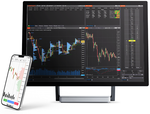
An interior page hero
A slanted background image with an optional floating foreground image. Good for the top of a product or feature page.
Learn more03 · Image + text
Image + text block — SideBySide
Use this when: explaining a benefit or feature with a supporting image. Claude alternates the image left and right as you stack these down a page (the two below show both directions).

Image on the left, text on the right
A picture on one side and a heading, paragraph, and button on the other. Replace this body text with your message.

...and the same block, flipped
Setting flipped swaps the image to the other side. Alternating keeps a page visually balanced.
04 · Feature highlight
Feature highlight — SellingPoint
Use this when: calling out a single benefit with an icon, a title, and a short description.

A single highlight
A small block with an icon, a title, and a short description. On its own here; shown in a row of three in the next block.
05 · Card grid
Card grid — CardGrid
Use this when: showing several feature highlights of the same kind together, usually three or four across.

First benefit
A short description of the first benefit goes here.

Second benefit
A short description of the second benefit goes here.

Third benefit
A short description of the third benefit goes here.
06 · Text section
Text section — RichText
Use this when: any prose that doesn't need an image beside it — headings, paragraphs, lists, and links. (Every grey label on this page is itself a RichText block.)
A formatted text section
This block renders formatted text: bold, italic, and links. It can hold paragraphs, headings, and lists, for example:
- A first list item
- A second list item
- A third list item
Set its width to contained (as here) to keep the line length comfortable, or full to span the section.
07 · Bulleted list
Simple bulleted list — MarginsItem
Use this when: a tidy, plain-text bulleted list with an optional heading.
A simple bulleted list
-
First item in the list
-
Second item in the list
-
Third item in the list
08 · Tabs
Tabs — Tabs
Use this when: organizing related content the reader switches between. Tabs on desktop; an accordion on mobile.
Tabbed content
Each tab reveals a different panel of content.
09 · FAQ
Frequently asked questions — AccordionList
Use this when: addressing common questions, usually near the bottom of a page. Each question expands to show its answer.
The answer to the first question goes here. Answers can include links and short paragraphs.
The answer to the second question goes here.
The answer to the third question goes here.
10 · Carousel
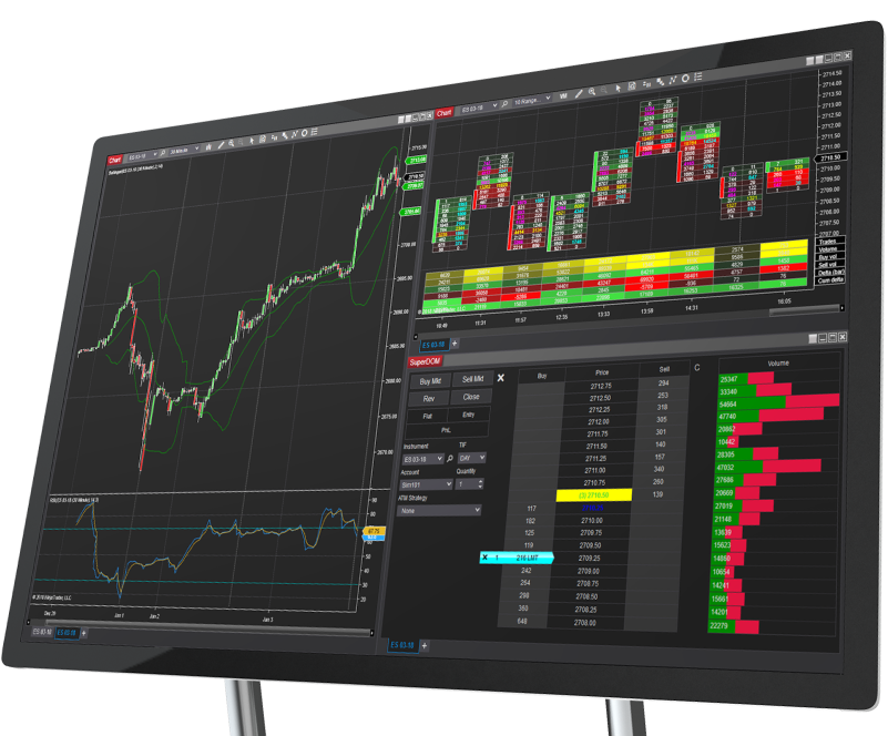
Image carousel — Carousel
Use this when: rotating through several promo panels, each with an image, title, description, and button.

11 · Blog carousel
Blog post carousel — BlogCarousel
Use this when: featuring a row of recent blog posts with a "view all" link.
From the blog
View all posts12 · Video
Featured video — FeaturedVideoPlayer
Use this when: a thumbnail should open a video in a pop-up player. Click the thumbnail below to see it.
13 · Awards
Awards strip — AwardsListing
Use this when: showcasing badges or awards with a heading, description, and optional button.
Awards & recognition

Show badges or awards together, with an optional heading and button.
An awards strip
-

Award one
A short caption
-

Award two
A short caption
-

Award three
A short caption
14 · List + image
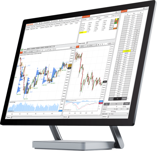
List with side image — BannerContentItemListing
Use this when: a list of short text items needs an image beside it.
15 · Button
Standalone button — CtaButton
Use this when: a single, clear next step on its own ("Get started", "Open an account").
Structural blocks (handled for you)
These blocks don't have a "design" of their own — they're layout and technical helpers Claude reaches for automatically. You normally won't need to ask for them by name.
- Columns — places two, three, or more blocks side by side in one row. Ask for it as "put these next to each other."
- Anchor (
AnchorTarget) — an invisible bookmark so a link can jump to a spot on the page. - Embed (
ScriptEmbed) — drops in a third-party embed or tracking snippet exactly as provided. - Margins table (
MarginTable) — the live, sortable futures-margins table on the pricing pages. - Sitemap (
Sitemap) — the automatically generated list of every page, used only on the sitemap page.